Sprint #11: "Asset management is key."
September 9th, 2018
Have you ever noticed how hard it is to do something you're bad at? In my speedrun days, it was always really easy to lose time while practicing a game by just playing portions that I had already, more or less, mastered. It's fun to feel like you've gotten good at something so practicing it is just you constantly giving yourself a reminder of same. It's much less fun to spend time on something that you haven't yet mastered, flailing and making mistakes along the way. I bring this up because, as one could probably guess (if I haven't explicitly said it before), my pedigree is much more code than art or music and, as a result, I've noticed that I've been neglecting my asset duties. For this sprint, I decided to force myself to work only on assets, the things that get me out of my comfort zone.
Putting a face on the enemy
The most obvious pieces of artwork still missing from Ensue has been the enemies. If nothing else, I wanted to be sure to make a first pass at what enemies in this game could look like. In addition to making me think a bit more about the greater context of what's going on in the game, some type of basic sprite/animation work would just go a long way towards making this feel ever more like a real video game. Here's what I came up with.
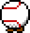
So, yeah, this is what a Pacer (which is a very, very secret internal code name) looks like. Obviously, it's a little baseball that, I think, works quite well with the greater game. (The goofy idea that a strike zone's enemies are baseballs resonates well with my brain.) As I was working on this sprite, though, I really enjoyed that the laces of a baseball can sort of substitute for expression by simulating a brow and a mouth. I had a very similar reaction when I first started working on the hero's sprite. The whole notion of deriving human-like expression from inanimate and/or imaginary objects is exciting to me and, I imagine, will be somewhat of a theme going forward.
I have several other enemies besides the Pacer, though, so I couldn't quite stop there. I ended up with four different variations of the baseball sprite for the Pacer, Hopper, Jumper, and Sitter, respectively shown here.
In no way am I going to say that I'm a great animator or pixel artist or whatever but I will happily mention that the life these sprites have breathed into the game has been great for morale. It's so much fun to experience visual changes with something you're working on and a huge bonus when you feel like they work well. As development continues, I'll probably be experimenting with different colors for the enemies and I surely don't want every single one to be some version of a baseball. For now, though, I think this is a great start.
A different kind of scalability
Did you happen to notice the hero in that little video? The hero got a little bit of an overhaul during this sprint because of what I've decided was a scaling issue. Let's take a moment to recall what the basic hero sprite used to look like.
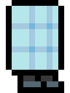
Actually, I ended up moving his feet over to the left one pixel but, whatever, that's close enough. This is what the hero looks like now.
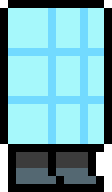
So, what happened? Even though the colors are obviously pretty different, the main thing that changed was the scaling. The hero had previously been drawn as a 10x16 sprite that was scaled up by a factor of three to be 30x48. That means that, for instance, the hero's outline was three pixels wide. That gave it a look that I thought was cool but had an unfortunate problem being compatible with enemies.
Until this sprint, enemies had been universally represented as 32x32 boxes with no artwork. Once I started working on more sprites, it became clear that I was going to have to make a decision: did I want to keep working with deliberately-small canvases and scale them up or did I want to just try render sprites pixel-for-pixel? Given how little of an artist I am, it seemed like the simpler decision was to go with small canvases and scale up.
The number 32, however, isn't evenly divisible by 3, which meant that I couldn't work on any size canvas and scale it up at exactly the same factor as I'd scaled the hero. Put a different way, if I didn't change something, the hero was going to look very different from enemies, as if his pixels were bigger (because they were). I had a couple of options.
The first option was to maintain the 3x scaling and choose an eventual sprite size that was evenly divisible by 3 in both dimensions, maybe 33x33. Then, I could work on an 11x11 canvas but still have my enemy sprites look like they were created with the same constraints that the hero's sprite was. 11x11 just felt too small, though, and there was a little bit of a mental block being so close to 32x32 (32 being a power of two, which means that computer nerds are in love with it) but not quite being there. If I wanted a bigger base canvas, that would mean that the resultant sprite would get much bigger. A 16x16 base canvas turns into a 48x48 sprite, which means that I now have to reconsider the general scale of things that happen in my levels. I didn't want any part of this can of worms.
So, the other option, was to change the scaling factor across all entities. A fun thing about the number 2 is that half of all integers are evenly divisible by it so, you know, that seemed like a natural choice. No matter what canvas size I wanted, I would always be just one pixel away from having something that would scale up nicely by a factor of 2. For enemies, I could immediately start using a base canvas of 16x16 and easily scale up to 32x32. For the hero, though, I had to go back and redo a bunch of things.
I still wanted the hero, once you're actually playing the game, to be on that 30x48 order of size, which immediately suggests a 15x24 base canvas size. I ended up using 14x24 because having that even number of pixels on the x-axis just ended up making a few things easier and more symmetrical. What I also got, though, was a higher resolution to play with. The original 10x16 base canvas only gives me 160 pixels that I can use but 14x24 gives me 336, over double! That's why the new hero appears more detailed--especially around the feet--than the old.
It took me quite some time to redo the hero's feet in a way that I was satisfied with and I'm still getting adjusted to seeing the sleeker version in the actual game but I think it's, overall, a very positive change. Certainly, in the longer term, it's going to be much easier to deal with a scaling factor of 2 (or something that's a power of 2) than it would have been to insist on using a factor of 3. All of these subtleties were things that I've had in the back of my mind for some time now but focusing on assets for a couple of weeks is what finally made me confront them.
Taking the lead
Art isn't the only thing that's gotten neglected, though. Music, also, has been something I've willfully ignored for most of the summer. So, to reset you, I've been using the excellent MilkyTracker to track what elementary music ideas I have. I know that I want a final Ensue product to have a soundtrack that evokes the era of classic video games, which makes a tracker the perfect tool to use.
They don't tell you, though, that you have to either create your own samples or go find them yourself. Being the extremely stubborn, independent-to-a-fault personality that I am, I'm insisting on creating all of my own samples. This sometimes means, quite literally, drawing with my mouse the waveform that I want synthesized. Thankfully, there are some very good tutorials out there that help newbies like me a ton to figure out just, for instance, what a bass drum's wave looks like and how it's different from a crash cymbal's.
Without going too deep into the details (which I wouldn't be doing justice, believe me), I spent a bit of time trying to clean up and otherwise improve the samples that I've been using for songs, now armed with more knowledge about the wave shape I should be interested in. I also wanted to track an iteration on the boss music concept that I previewed back in Sprint #2, ideally coming up with a lead part and just more fully fleshing it out. Here's what I came up with.
When you compare it to the old version, it's obviously much further along but, I've got to say, coming up with that lead part was a huge challenge for me. This whole process has taught me that I really don't think in leads or, if I do, I tend to assign them to the bass instead of a higher-pitched instrument. For the most part, the lead in this tune just explores arpeggios. Although that's a tried and true way to get some good-sounding notes down, I feel like it's, overall, rather simple and it sort of paints the song into a corner. Put a different way, I feel like the lead ends up sounding samey. Don't get me wrong, though. I like it. Now, if I could only find some bosses to give the music to...
Closing thoughts
Overall, it was a really productive sprint on a couple of portions of the game that it's really easy for me to ignore for long periods of time. I've already linked a couple of the sample tutorials I used for the music but, in the pixel art realm, a lot of really helpful resources were found by just searching for "pixel art shading" and clicking a bunch of stuff. If I were to recommend two specific links, Derek Yu's pixel art tutorial and Luke Oliveem's coloring and shading tutorial would be them.
Finally, Sprint #11 served as a huge reminder that visual changes impact my perception of the project disproportiately more than any other types of changes, certainly way more than just making something more efficient in code. It's very clear to me why so-called solo game developers often end up contracting out the media work: much as they hate to admit it, a successful game needs to look and sound good much more than it needs to perform good. So to speak.
Next sprint
As has become an RDG tradition, the content of the next sprint is a bit up in the air but I've decided that I'm definitely going to come out of it having a mechanism for all of you--yes, you!--to sign up for an on-some-heretofore-unknown-time-interval newsletter. It seems like a mailing list is a very cheap way to help foster my lackluster marketing efforts and, having a mainly-web background, it shouldn't take very long for me to rig that up. As far as the rest of the sprint goes, I'm leaning towards spending some very good time on level design, so I'm hopeful that I'll have some new, or at least more polished, challenges to present next time.